 Comics about mathematics, science, and the student life.
Order of Operations

The fun part is when a change here implies a rewrite there, there, and there.
24 May 2023
Meteoric Announcement

Well, at least you can say you put out some new science on a day that many people actually thought about science.
19 May 2023Seed

“Wait, have you checked if this is an invasive plant species?”
“Nah, just look at how small it is! It’ll be fine.”
17 May 2023
Explanation Skills
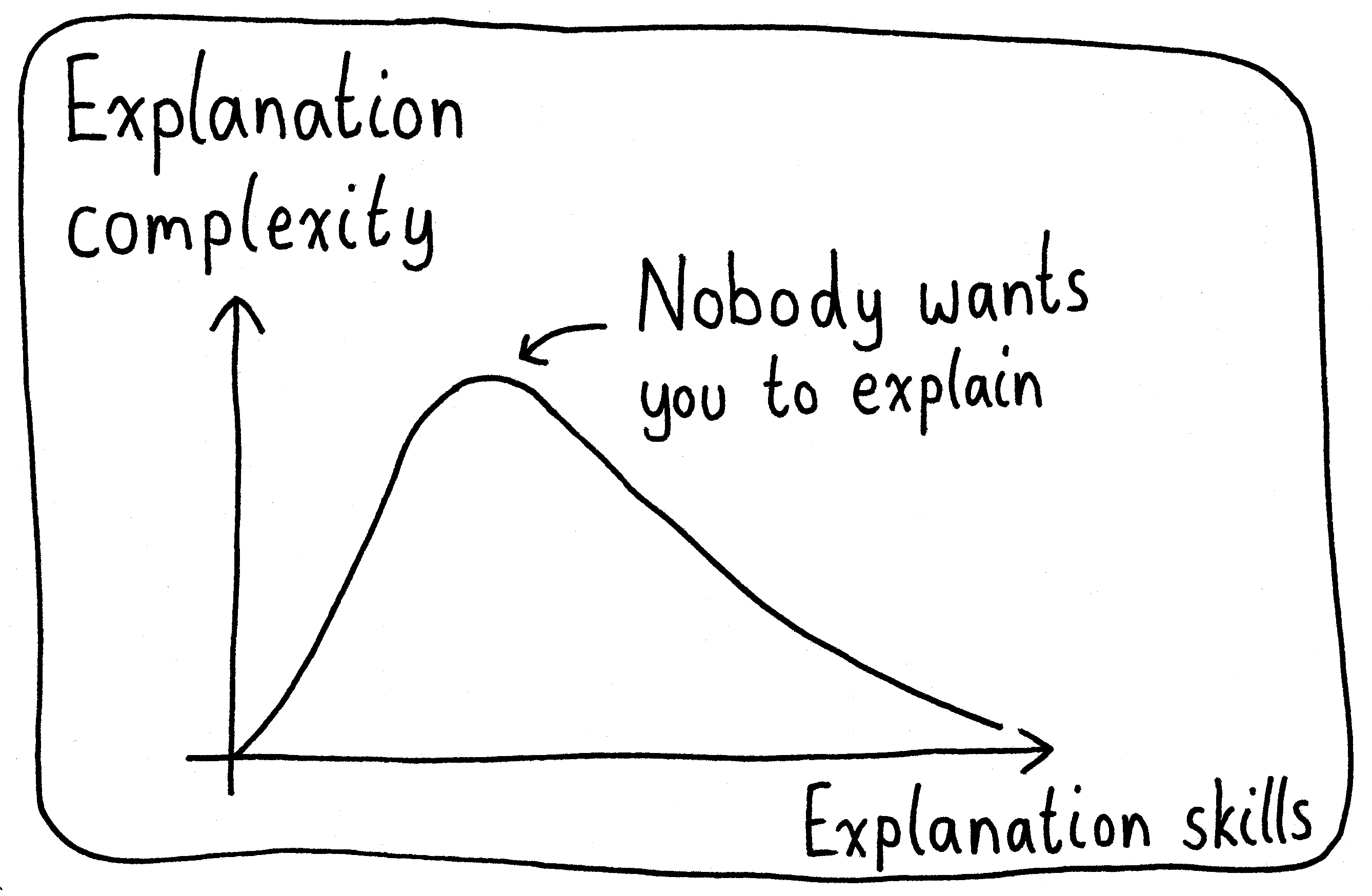
Have you ever started explaining something, only for the others in your discussion to quickly pivot away from the topic? If so, there’s a chance you were in that middle hump. (I’ve been there too.)
12 May 2023Dead End
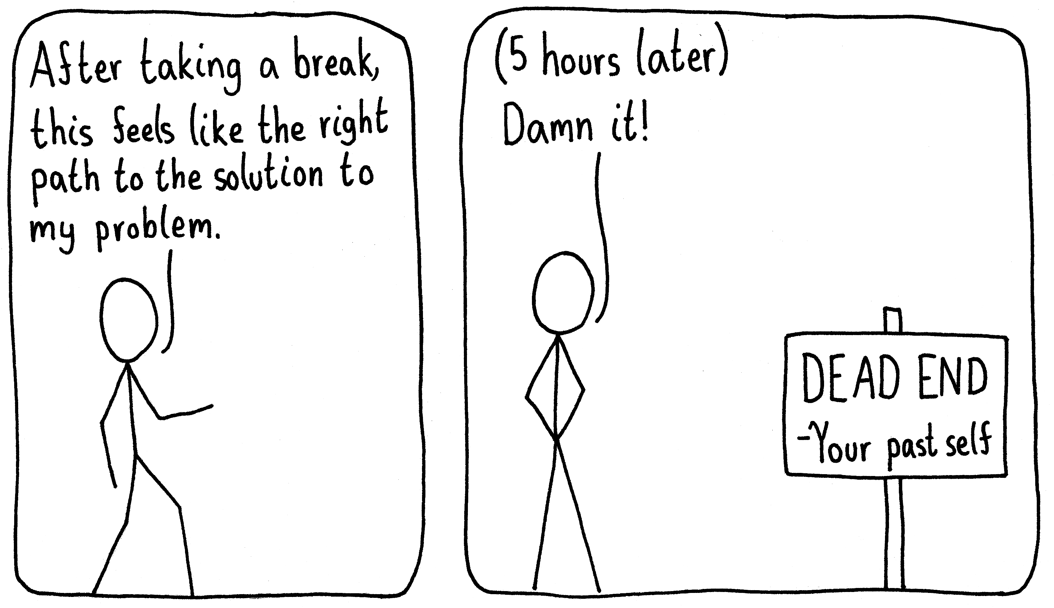
On the other hand, being forgetful can sometimes give you the motivation you need to keep going on a project that seems to have no way forward.
10 May 2023Research Taste

As a graduate student, I’d sometimes be happy enough to just have all those ideas!
08 May 2023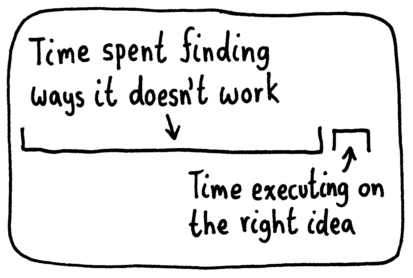
Leader

“There’s just you, isn’t there?”
“No! And even if there was just me, that wouldn’t change my statement!”
03 May 2023