Comics about mathematics, science, and the student life.

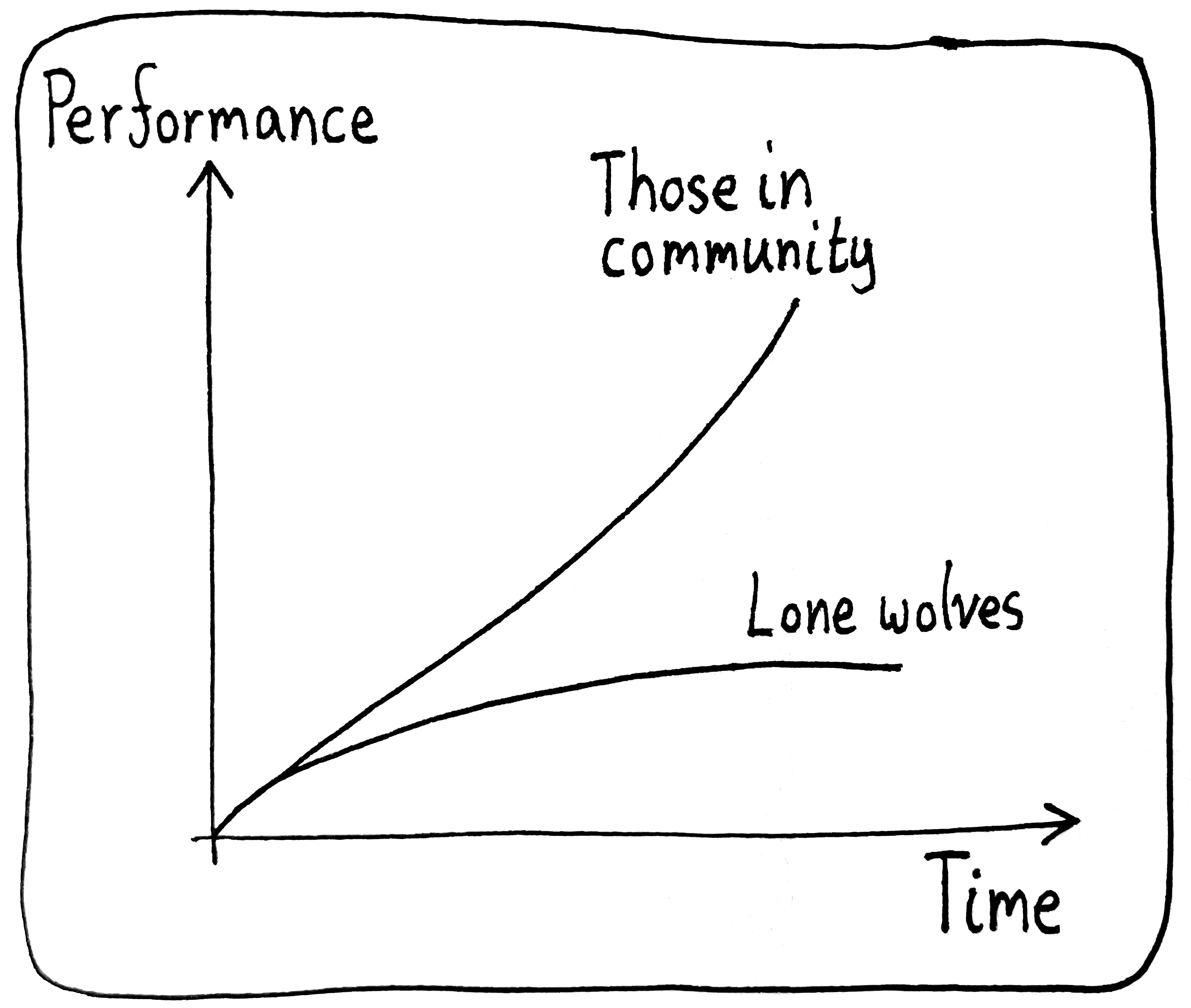
Tabs

Unless you’re like me, in which case plenty of your tabs become zombies in your browser…
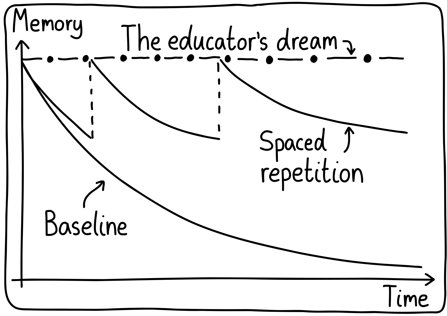
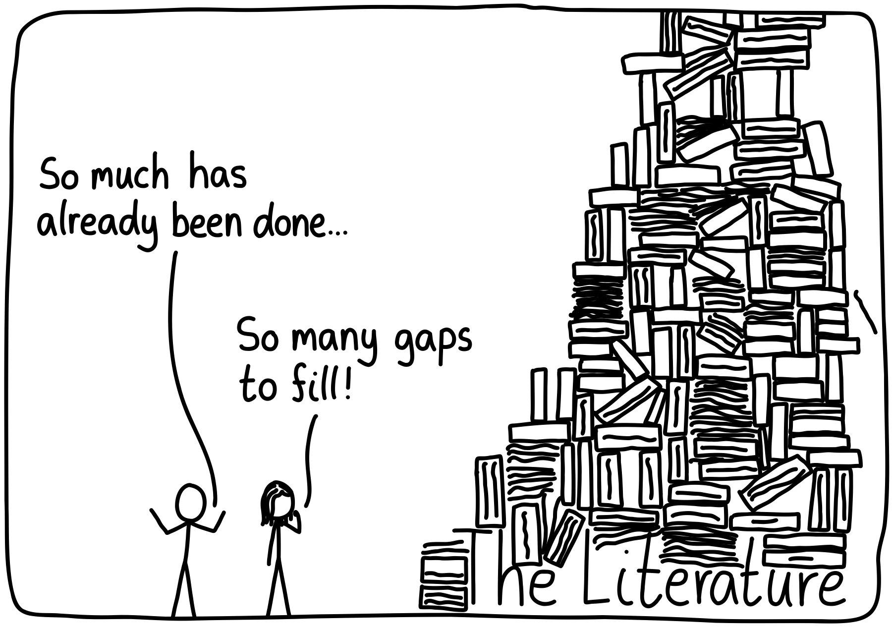
07 Jun 2025Long Exposure
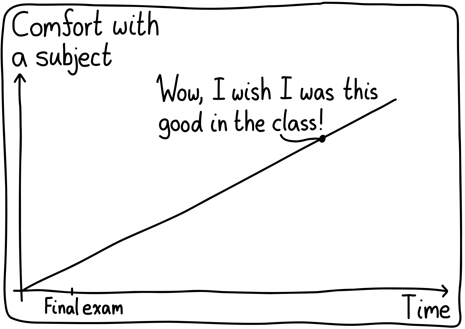
Of course, this is for subjects that you still use! For myself, this subject is linear algebra. I was pretty confused about it when I first learned the subject, but ever-so-slowly, I’ve become much better at it. What subject is this for you?
31 May 2025
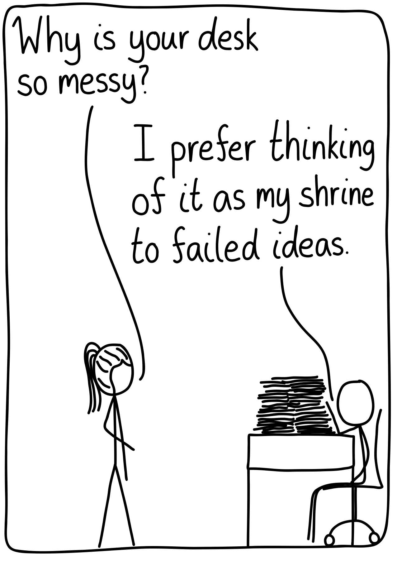
Filler Packaging
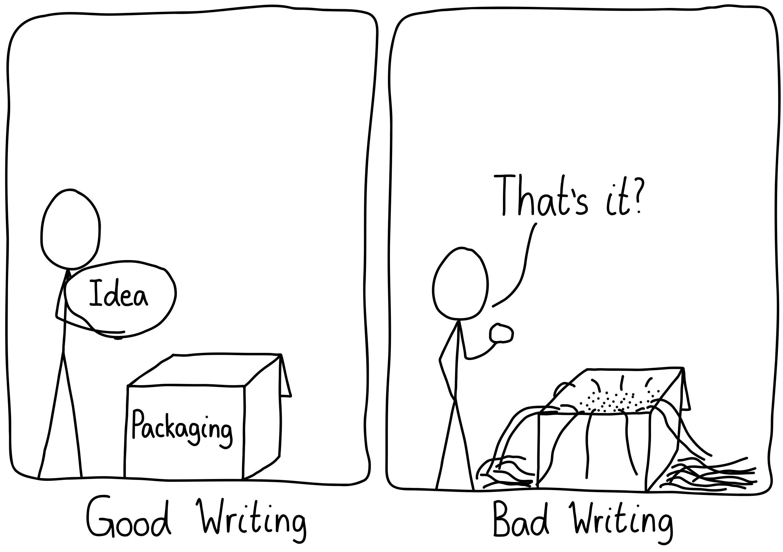
Note, this is not to say that all books should be essays! Rather, find the appropriate container for your idea.
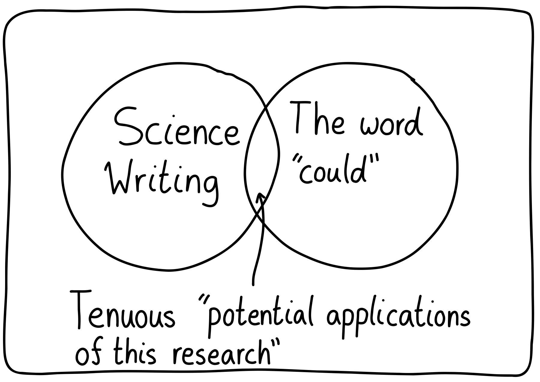
17 May 2025